De-Constructing Magazine Front Covers
So we've recently been set a task, to de-construct two magazine covers which are similar to the genre of the magazine that we will be creating in the near future. At the moment, I don't really have a clear view on what type of magazine I want to create, so I chose magazines that I really liked the look of.
The first magazine I chose was Vibe Magazine. In my previous post, I had showed the conventions of a Vibe Magazine cover, and I really liked the layout of them, so here is what I've found:
On the front of the cover we have Chris Brown as the main image. This also shows that the main article would be about Chris Brown. There is also a part on the page where it says 'Exclusive' above the Cover Line of Chris Browns interview. When I first looked at this magazine, I really liked it because its simple yet very eye catching, and this is how I want my magazine to be. Like a normal magazine, the magazine consists of many general conventions such as Cover Lines, a Main Image, a Mast Head, and a selling line at the top.
The colour schemes on this magazine are yellow, white and black. The title of the magazine is a very bright yellow and the main image covers the title. Even though the main image covers the title, we still know what the name of the magazine is, which is something that I may try out with my magazine.
The articles in the Vibe Magazine mainly feature news about music, movies, TV, and culture.
The magazine also has an online site where you can read articles, view blogs and more,
 Vibe Magazine is sold in the USA, so I'm not really sure of the price, but considering the types of artists they normally have on their front covers, I would assume that their magazines would sell for at least £2 in the UK.
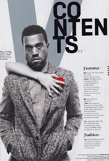
De-constructing the Contents Page:
Of all the Vibes Magazines I've seen, they're contents pages all have the same style. They always have an image of the artist who was on the front cover on the contents page, with the letter 'V' as a background. They also have the word 'Contents' written in an original way. On the contents they tend to have headings such as 'Features' 'Regulars', and 'Fashion' etc.
I like the way that the magazine contents page is laid out as its very clear and simple, and you can tell from the contents who the main article will be about.
No comments:
Post a Comment