Tuesday 24 April 2012
Magazine Feedback
Here is a video of my peers' opinion on my final magazine.
I made this video using iMovie, on an Apple Mac in school. I took the videos on my own Samsung compact camera, and exported the clips into the program to create this video. I also added in some background music from my phone onto the video to make it more interesting; the backing track is also the type of music that my target audience would probably listen to.
Enjoy:
Media Magazine Evaluation
Here is my Media Magazine Evaluation.
Here's a link for my prezi presentation: http://prezi.com/hmrr51grosa_/media-studies-magazine-evaluation/
Thursday 12 April 2012
Double Page Spread; Step-By-Step

Step 1.
To create my Double Page Spread I had to use different characteristics to create the page.
I then took one of the pictures that I had taken, and cut out a part of it which was a brick wall. I then pasted this three times on the double page spread, to create the wall effect at the top of the page. My flat plan shows the top part of the page sectioned off so that I could put pictures of the artist along the top. However later on when I tried to put small pictures on top of the wall, it didn't look good to me so I changed it.

Step 2.
I then added a picture of the main artist, Poze Da Poze, which I cut out of one of my other pictures and pasted onto this page. I put the picture over the top of the brick wall, so that the audience would be more attracted to the image rather than the brick wall.
.png)
Step 3.
In this step I decided to add the name of the artist, Poze Da Poze, as the title of the article. I chose the same font that I used on the front cover from www.fontspace.com, but changed the colour from white to green. This was done to keep the magazine consistent.
 Step 4. I then added ways to get in contact with the artist; through his Facebook and his Twitter account. This isn't a convention that I have actually seen in a magazine. However I noticed that when you go on an artists official website, they reference the other ways in which their fans can keep up with what they are doing through social networking sites such as Facebook and Twitter.
Step 5.
In this step I added a brief introductory paragraph, about the artist and what we will be covering during the interview.
I typed up the paragraph in Microsoft Word to make sure that the spelling and grammar were correct, and then I pasted it into Adobe Photoshop.
In put the paragraph about the name, Poze Da Poze as at the end of the Paragraph it says 'Underground Alert presents;'. This is a regular feature segment in my magazine, that covers all the interviews about new upcoming Underground artists from the scene. 'Underground Alert' is a feature in the magazine to alert the readers.

Step 6.
I then decided to add all the shapes which I wanted on the page, which was a banner on the top left hand corner, which I will then write the word 'EXCLUSIVE' in (this matches the one that is on the front cover to keep the magazine consistent), and a box at the bottom of the page which is where I planned to write the page number.

Step 7.
In this final step I added all of the text from the interview. I typed up the interview in Microsoft Word and then copied and pasted it into Adobe Photoshop.
I put the questions in pink, and the answers in white, to help make it clear to the reader who is who in the interview.
I also added the pull quote which was on the front cover of the magazine in a box that had been edited, however the layers had been pressed so there is not separate layer to show how that box on the middle had been made. The interview is Poze Da Poze's first interview ever.
Final Double Page Spread;

This is how my Double Page Spread turned out.
-
Poze Da Poze is a real up and coming artist. If you would like to see more about him you can go to his Facebook page and follow him on Twitter.
Twitter: http://twitter.com/#!/pozedapoze
Facebook: http://www.facebook.com/pozedapoze
:)
Contents Page; Step-By-Step

For my contents page I also needed to set the page characteristics as set before on my front cover. After doing this I decided to start with the shapes that I would want on my contents page. For my contents page I didn't follow my flat plan completely because I realised that I hadn't taken enough pictures to put on the contents page.

Secondly I decided to put the title of the magazine on the contents page, and the title 'This Month...'. I chose to put 'This Month...' instead of 'Contents' at the top because I wanted my magazine to seem more original. I also put the title of my magazine on the contents page as I wanted to create a sense of continuity within my magazine. I also wanted the masthead to be the logo for the magazine so that whenever people saw it they would know what it meant or represented. The colour scheme I decided to was very different to the one that I originally planned to use. This was due to the fact that I used the colours that my cover artist was wearing so that everything fitted together,

In this step I decided to put headings for the three sections there would be in my magazine; the 'News', the 'Features' and the 'Regulars'.
I decided to write these in the same font as the masthead on the front cover and at the top of the contents page to make the magazine more consistent.

I decided to add all the numbers first, so that I could put all the writing in later. If I was was creating a whole magazine I wouldn't have just put in random numbers because certain articles have a particular amount of pages so it may not have matched. However it managed to work out for this project, and if I had needed to change any of the numbers I could have because they were written and in layers.

In this step I decided to add my 'Editors Note'. I called it an 'Editors Note' rather than an 'Editors Letter' because I wanted it to sound more casual and less formal; my target audience are generally young so they would like to read something that isn't too serious so that they understand it better and enjoy reading it more. This is what I was going for when I wrote my editors letter. I wrote out the actual letter on Microsoft Word so that I could spell check my work, and then copied and pasted everything onto the front cover.

Next I added the polaroids which I wanted to use as the frame for my pictures on the contents page. My target audience is generally young people and they tend to take a lot of pictures due to social networking sites such as Facebook and Twitter. There are also image software's that young people use on their phones or their pc's, where they can edit their images; one of the things they can do is to have a polaroid frame around their picture so that it looks like a polaroid. That is where I got the polaroid idea from. I have never really seen this idea anywhere else so I decided that I would try to go against the normal conventions of a magazine contents page and decided to use many pictures instead. This idea was portrayed on my flat plan, however I discovered a major fault when starting the contents page; I hadn't taken enough pictures to put on the contents page. Therefore I decided to put some pictures at the bottom of the page, however I still incorporated polaroids in my design.

In this step I added all the pictures the I had taken and put them in the polaroids. I did this by copying the pictures to the page, adjusting the size and the angle that they were in, and placed them behind the polaroid layer so that they looked as if they were part of the polaroids.
Step 8.
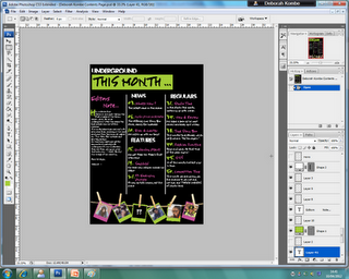
The last thing I had to do was to put all the writing on the contents page. I added the things from the front cover of the magazine and some other articles that would relate to the magazine and the genre in any way.
Final Contents Page;

This is how the contents page turned out.
:)
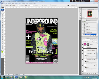
Front Cover; Step-By-Step
Here is a step-by-step process of how I created my final front cover;
 Step 1.
The first step was to open up a new page on Adobe Photoshop, with the right characteristics to create a front cover.
The preset was 'International Paper'.
The width was '210 mm'.
The height was '297 mm'.
The resolution was '150 pixels/inches'.
The colour mode was 'RGB Colour, 16 bit'.
And the background contents was 'White'.


 Step 2.
In this step I put the main image on the front cover. To do this I took one of the pictures that I can taken from the photo shoot and cut it out of the original picture using Adobe Photoshop. I then copied to cut out picture to make another layer on top of the original picture. After this I dragged the cut out picture onto the front cover, and resized it to fit the page. This is the main picture for my final front cover.


Step 7.
In this step I added the name of the artist who is featured on the cover of my magazine, Poze Da Poze.
I chose a completely different font for his name to emphasise the importance of his role in this months magazine issue.
I also got this font from www.fontspace.com, the same place as where I got the font for my masthead.
Step 8.
I then added Poze Da Poze's pull quote, and a caption about him under his name to show that the main article in the magazine will be about him.


The first step was to open up a new page on Adobe Photoshop, with the right characteristics to create a front cover.
The preset was 'International Paper'.
The width was '210 mm'.
The height was '297 mm'.
The resolution was '150 pixels/inches'.
The colour mode was 'RGB Colour, 16 bit'.
And the background contents was 'White'.


I then tried to find a picture out of all of the pictures to put as my main image. Beforehand, I did a photoshoot with the main artist on the front cover, Poze Da Poze. He will also be featured on my contents page and will be the subject of my double page spread.
The two pictures above are examples of the types of pictures that I had taken and considered using.
Step 2.

In this step I put the main image on the front cover. To do this I took one of the pictures that I can taken from the photo shoot and cut it out of the original picture using Adobe Photoshop. I then copied to cut out picture to make another layer on top of the original picture. After this I dragged the cut out picture onto the front cover, and resized it to fit the page. This is the main picture for my final front cover.
Step 3.
In this next step I decided to add the masthead onto the page. I got the font from a website, www.fontspace.com, and chose one of the graffiti fonts. I chose this particular font because in the font you can see the outlines of a city. Underground music featured in my magazine would mainly be artists from the city of London, which relates to the image seen within the font. Also the word Underground is a word used to name the train system running in the underground in the city of London, which is also another reason for my choice of font.
Step 4.
Next, I decided to add a barcode to my front cover to, as every magazine needs one. I took this one from the internet (google). I put the barcode sideways because many of the music magazines that I had researched had it the same way, so it seemed like a normal convention.

Step 5.
I also added another type of barcode, which would enable smartphone users to scan the code so that they could get a type of app or a freebie on their phone. This is a new type of technological convergence as companies now have this type of barcode to promote their business and to make it available to a wider audience.

In this step I decided to add all of the cover lines and shapes, as well as another small picture on the side.
I also added the price of the magazine, the magazines official website, the issue month of the magazine, and a line at the bottom that describes my magazine as 'Voted as the UK's NO.1 Underground Magazine'.
Step 7.

In this step I added the name of the artist who is featured on the cover of my magazine, Poze Da Poze.
I chose a completely different font for his name to emphasise the importance of his role in this months magazine issue.
I also got this font from www.fontspace.com, the same place as where I got the font for my masthead.

Step 8.
I then added Poze Da Poze's pull quote, and a caption about him under his name to show that the main article in the magazine will be about him.
Final Front Cover;

This is how my front cover turned out.
:)
Subscribe to:
Posts (Atom)