
For my contents page I also needed to set the page characteristics as set before on my front cover. After doing this I decided to start with the shapes that I would want on my contents page. For my contents page I didn't follow my flat plan completely because I realised that I hadn't taken enough pictures to put on the contents page.

Secondly I decided to put the title of the magazine on the contents page, and the title 'This Month...'. I chose to put 'This Month...' instead of 'Contents' at the top because I wanted my magazine to seem more original. I also put the title of my magazine on the contents page as I wanted to create a sense of continuity within my magazine. I also wanted the masthead to be the logo for the magazine so that whenever people saw it they would know what it meant or represented. The colour scheme I decided to was very different to the one that I originally planned to use. This was due to the fact that I used the colours that my cover artist was wearing so that everything fitted together,

In this step I decided to put headings for the three sections there would be in my magazine; the 'News', the 'Features' and the 'Regulars'.
I decided to write these in the same font as the masthead on the front cover and at the top of the contents page to make the magazine more consistent.

I decided to add all the numbers first, so that I could put all the writing in later. If I was was creating a whole magazine I wouldn't have just put in random numbers because certain articles have a particular amount of pages so it may not have matched. However it managed to work out for this project, and if I had needed to change any of the numbers I could have because they were written and in layers.

In this step I decided to add my 'Editors Note'. I called it an 'Editors Note' rather than an 'Editors Letter' because I wanted it to sound more casual and less formal; my target audience are generally young so they would like to read something that isn't too serious so that they understand it better and enjoy reading it more. This is what I was going for when I wrote my editors letter. I wrote out the actual letter on Microsoft Word so that I could spell check my work, and then copied and pasted everything onto the front cover.

Next I added the polaroids which I wanted to use as the frame for my pictures on the contents page. My target audience is generally young people and they tend to take a lot of pictures due to social networking sites such as Facebook and Twitter. There are also image software's that young people use on their phones or their pc's, where they can edit their images; one of the things they can do is to have a polaroid frame around their picture so that it looks like a polaroid. That is where I got the polaroid idea from. I have never really seen this idea anywhere else so I decided that I would try to go against the normal conventions of a magazine contents page and decided to use many pictures instead. This idea was portrayed on my flat plan, however I discovered a major fault when starting the contents page; I hadn't taken enough pictures to put on the contents page. Therefore I decided to put some pictures at the bottom of the page, however I still incorporated polaroids in my design.

In this step I added all the pictures the I had taken and put them in the polaroids. I did this by copying the pictures to the page, adjusting the size and the angle that they were in, and placed them behind the polaroid layer so that they looked as if they were part of the polaroids.
Step 8.
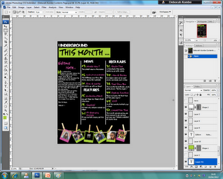
The last thing I had to do was to put all the writing on the contents page. I added the things from the front cover of the magazine and some other articles that would relate to the magazine and the genre in any way.
Final Contents Page;

This is how the contents page turned out.
:)
No comments:
Post a Comment