Tuesday, 24 April 2012
Magazine Feedback
Here is a video of my peers' opinion on my final magazine.
I made this video using iMovie, on an Apple Mac in school. I took the videos on my own Samsung compact camera, and exported the clips into the program to create this video. I also added in some background music from my phone onto the video to make it more interesting; the backing track is also the type of music that my target audience would probably listen to.
Enjoy:
Media Magazine Evaluation
Here is my Media Magazine Evaluation.
Here's a link for my prezi presentation: http://prezi.com/hmrr51grosa_/media-studies-magazine-evaluation/
Thursday, 12 April 2012
Double Page Spread; Step-By-Step

Step 1.
To create my Double Page Spread I had to use different characteristics to create the page.
I then took one of the pictures that I had taken, and cut out a part of it which was a brick wall. I then pasted this three times on the double page spread, to create the wall effect at the top of the page. My flat plan shows the top part of the page sectioned off so that I could put pictures of the artist along the top. However later on when I tried to put small pictures on top of the wall, it didn't look good to me so I changed it.

Step 2.
I then added a picture of the main artist, Poze Da Poze, which I cut out of one of my other pictures and pasted onto this page. I put the picture over the top of the brick wall, so that the audience would be more attracted to the image rather than the brick wall.
.png)
Step 3.
In this step I decided to add the name of the artist, Poze Da Poze, as the title of the article. I chose the same font that I used on the front cover from www.fontspace.com, but changed the colour from white to green. This was done to keep the magazine consistent.
 Step 4. I then added ways to get in contact with the artist; through his Facebook and his Twitter account. This isn't a convention that I have actually seen in a magazine. However I noticed that when you go on an artists official website, they reference the other ways in which their fans can keep up with what they are doing through social networking sites such as Facebook and Twitter.
Step 5.
In this step I added a brief introductory paragraph, about the artist and what we will be covering during the interview.
I typed up the paragraph in Microsoft Word to make sure that the spelling and grammar were correct, and then I pasted it into Adobe Photoshop.
In put the paragraph about the name, Poze Da Poze as at the end of the Paragraph it says 'Underground Alert presents;'. This is a regular feature segment in my magazine, that covers all the interviews about new upcoming Underground artists from the scene. 'Underground Alert' is a feature in the magazine to alert the readers.

Step 6.
I then decided to add all the shapes which I wanted on the page, which was a banner on the top left hand corner, which I will then write the word 'EXCLUSIVE' in (this matches the one that is on the front cover to keep the magazine consistent), and a box at the bottom of the page which is where I planned to write the page number.

Step 7.
In this final step I added all of the text from the interview. I typed up the interview in Microsoft Word and then copied and pasted it into Adobe Photoshop.
I put the questions in pink, and the answers in white, to help make it clear to the reader who is who in the interview.
I also added the pull quote which was on the front cover of the magazine in a box that had been edited, however the layers had been pressed so there is not separate layer to show how that box on the middle had been made. The interview is Poze Da Poze's first interview ever.
Final Double Page Spread;

This is how my Double Page Spread turned out.
-
Poze Da Poze is a real up and coming artist. If you would like to see more about him you can go to his Facebook page and follow him on Twitter.
Twitter: http://twitter.com/#!/pozedapoze
Facebook: http://www.facebook.com/pozedapoze
:)
Contents Page; Step-By-Step

For my contents page I also needed to set the page characteristics as set before on my front cover. After doing this I decided to start with the shapes that I would want on my contents page. For my contents page I didn't follow my flat plan completely because I realised that I hadn't taken enough pictures to put on the contents page.

Secondly I decided to put the title of the magazine on the contents page, and the title 'This Month...'. I chose to put 'This Month...' instead of 'Contents' at the top because I wanted my magazine to seem more original. I also put the title of my magazine on the contents page as I wanted to create a sense of continuity within my magazine. I also wanted the masthead to be the logo for the magazine so that whenever people saw it they would know what it meant or represented. The colour scheme I decided to was very different to the one that I originally planned to use. This was due to the fact that I used the colours that my cover artist was wearing so that everything fitted together,

In this step I decided to put headings for the three sections there would be in my magazine; the 'News', the 'Features' and the 'Regulars'.
I decided to write these in the same font as the masthead on the front cover and at the top of the contents page to make the magazine more consistent.

I decided to add all the numbers first, so that I could put all the writing in later. If I was was creating a whole magazine I wouldn't have just put in random numbers because certain articles have a particular amount of pages so it may not have matched. However it managed to work out for this project, and if I had needed to change any of the numbers I could have because they were written and in layers.

In this step I decided to add my 'Editors Note'. I called it an 'Editors Note' rather than an 'Editors Letter' because I wanted it to sound more casual and less formal; my target audience are generally young so they would like to read something that isn't too serious so that they understand it better and enjoy reading it more. This is what I was going for when I wrote my editors letter. I wrote out the actual letter on Microsoft Word so that I could spell check my work, and then copied and pasted everything onto the front cover.

Next I added the polaroids which I wanted to use as the frame for my pictures on the contents page. My target audience is generally young people and they tend to take a lot of pictures due to social networking sites such as Facebook and Twitter. There are also image software's that young people use on their phones or their pc's, where they can edit their images; one of the things they can do is to have a polaroid frame around their picture so that it looks like a polaroid. That is where I got the polaroid idea from. I have never really seen this idea anywhere else so I decided that I would try to go against the normal conventions of a magazine contents page and decided to use many pictures instead. This idea was portrayed on my flat plan, however I discovered a major fault when starting the contents page; I hadn't taken enough pictures to put on the contents page. Therefore I decided to put some pictures at the bottom of the page, however I still incorporated polaroids in my design.

In this step I added all the pictures the I had taken and put them in the polaroids. I did this by copying the pictures to the page, adjusting the size and the angle that they were in, and placed them behind the polaroid layer so that they looked as if they were part of the polaroids.
Step 8.
The last thing I had to do was to put all the writing on the contents page. I added the things from the front cover of the magazine and some other articles that would relate to the magazine and the genre in any way.
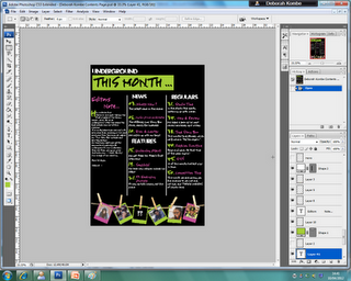
Final Contents Page;

This is how the contents page turned out.
:)
Front Cover; Step-By-Step
Here is a step-by-step process of how I created my final front cover;
 Step 1.
The first step was to open up a new page on Adobe Photoshop, with the right characteristics to create a front cover.
The preset was 'International Paper'.
The width was '210 mm'.
The height was '297 mm'.
The resolution was '150 pixels/inches'.
The colour mode was 'RGB Colour, 16 bit'.
And the background contents was 'White'.


 Step 2.
In this step I put the main image on the front cover. To do this I took one of the pictures that I can taken from the photo shoot and cut it out of the original picture using Adobe Photoshop. I then copied to cut out picture to make another layer on top of the original picture. After this I dragged the cut out picture onto the front cover, and resized it to fit the page. This is the main picture for my final front cover.


Step 7.
In this step I added the name of the artist who is featured on the cover of my magazine, Poze Da Poze.
I chose a completely different font for his name to emphasise the importance of his role in this months magazine issue.
I also got this font from www.fontspace.com, the same place as where I got the font for my masthead.
Step 8.
I then added Poze Da Poze's pull quote, and a caption about him under his name to show that the main article in the magazine will be about him.


The first step was to open up a new page on Adobe Photoshop, with the right characteristics to create a front cover.
The preset was 'International Paper'.
The width was '210 mm'.
The height was '297 mm'.
The resolution was '150 pixels/inches'.
The colour mode was 'RGB Colour, 16 bit'.
And the background contents was 'White'.


I then tried to find a picture out of all of the pictures to put as my main image. Beforehand, I did a photoshoot with the main artist on the front cover, Poze Da Poze. He will also be featured on my contents page and will be the subject of my double page spread.
The two pictures above are examples of the types of pictures that I had taken and considered using.
Step 2.

In this step I put the main image on the front cover. To do this I took one of the pictures that I can taken from the photo shoot and cut it out of the original picture using Adobe Photoshop. I then copied to cut out picture to make another layer on top of the original picture. After this I dragged the cut out picture onto the front cover, and resized it to fit the page. This is the main picture for my final front cover.
Step 3.
In this next step I decided to add the masthead onto the page. I got the font from a website, www.fontspace.com, and chose one of the graffiti fonts. I chose this particular font because in the font you can see the outlines of a city. Underground music featured in my magazine would mainly be artists from the city of London, which relates to the image seen within the font. Also the word Underground is a word used to name the train system running in the underground in the city of London, which is also another reason for my choice of font.
Step 4.
Next, I decided to add a barcode to my front cover to, as every magazine needs one. I took this one from the internet (google). I put the barcode sideways because many of the music magazines that I had researched had it the same way, so it seemed like a normal convention.

Step 5.
I also added another type of barcode, which would enable smartphone users to scan the code so that they could get a type of app or a freebie on their phone. This is a new type of technological convergence as companies now have this type of barcode to promote their business and to make it available to a wider audience.

In this step I decided to add all of the cover lines and shapes, as well as another small picture on the side.
I also added the price of the magazine, the magazines official website, the issue month of the magazine, and a line at the bottom that describes my magazine as 'Voted as the UK's NO.1 Underground Magazine'.
Step 7.

In this step I added the name of the artist who is featured on the cover of my magazine, Poze Da Poze.
I chose a completely different font for his name to emphasise the importance of his role in this months magazine issue.
I also got this font from www.fontspace.com, the same place as where I got the font for my masthead.

Step 8.
I then added Poze Da Poze's pull quote, and a caption about him under his name to show that the main article in the magazine will be about him.
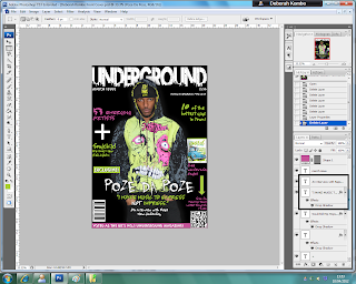
Final Front Cover;

This is how my front cover turned out.
:)
Sunday, 4 March 2012
Photo's
Our next task in creating our music magazine was to take the pictures that we would be using on our front cover, our contents page and our double page spread. This has however been a bit difficult for me as my commitments and my artists commitments have got in the way of our plans to take photos. Although its been difficult, I'm going to try to take my final pictures today, so that I can then manipulate them and put them in my magazine. I had taken some photos beforehand, but when I showed on of my teachers, he pointed me in the direction of a famous photographer who's work looked amazing. He told me to look at his work and try to emulate it, so I did.
The photographer is Yuri Arcur, the worlds most successful microstock photographer.
Here are some of his photo's;

On his website he also has a blog, one of the posts showing "8 Secrets From The Worlds Top Selling Photographer":
Eight Secrets from the World’s Top Selling Photographer
Posted Thursday, 13 September 2007 by Yuri Arcurs in Photography, Inspiration
You don't have to be a pro to take photos like a pro – we here at Crestock.com convinced the world’s top selling stock photographer, Yuri Arcurs, to share with us his top 8 secrets – a clear-cut guide to being successful as a photographer
1. Learn to see and frame your pictures in perceptual layers
What does this mean? A camera will only focus on one item; the elements behind and in front of this item can be viewed as layers: Foreground(s), focal point and background layer(s).The relationships between these layers are often what makes pictures interesting. If you look at prize-winning photojournalistic images, you will see a striking similarity; All the layers intervene perfectly and in some way or another complete or add to the feeling or idea of the picture.
Great pictures have many layers and they “speak” together. When shooting real-life photojournalism, this is one of the hardest aspects to master and really demands multitasking.
When shooting commercial photography, thinking in layers can be used as a tool to complete the image.
The background layer is often neglected by amateur photographers or is entirely missing – but by building up your layers step by step you can often gain a competitive advantage over other photographers.

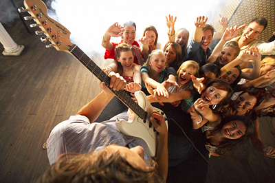
Notice how the first picture looks like a real concert, then take a look at the technical photo below it. It is not a concert, and only 23 models where present, but by being careful with foreground and background layers, the final shoot looks just like a real concert.
2. Think “icon”
Will the image you have in mind still function when viewed at the size of a small icon or if only viewed for a quarter of a second? Can you still decipher what’s happening in the picture?Great commercial shots have this characteristic and use different lighting and colours to create contrasts between the elements of the image.
In today’s fast moving everyday life, you need to create images that go straight for the point. In stock photography, the “icon effect” is the essence of how to make your pictures stand out. Too many obstacles and confusing design elements will greatly reduce the “icon effect”.
Choose with great care what you want in your foreground and background layers so it doesn’t become messy.


Here is an example of how we edit our pictures. Notice how taking away a lot of distracting elements makes the icon effect so much stronger.
3. Use stereotypes to strengthen your point
While reading the next few lines, try to do exactly what I tell you, and promise to really do this or you will miss the point. Only using your head, calculate 6x6, add 14 then subtract 50. Are you following? If not then calculate...Now think of a hand tool. Picture it in your head. Then think of a color. Close your eyes and picture this color in your head too.
Now if you belong to 95% of the normal population, you would have thought of a hammer and the color red. This is because the hammer and the color red are stereotypical members of the categories of “hand tools” and “colors”.
Use knowledge like this to strengthen your “Icon effect”.
If people only have a split-second of viewing, be wise and use stereotypes so people can easily identify the elements of the picture. Identifying stereotypes doesn’t have to be harder than using common sense.
In the category of 'classic female beauty' for example, Marilyn Monroe would probably be a good candidate for a stereotype, except she is pretty hard to get photos of, but you get the point.
The color of this guitar was chosen with great care. If it had been black or any other darker colour, it would simply have disappeared in the crowd. Choosing a white guitar makes it stand out and become iconic – even as a small preview it is pretty clear what this picture is about.
4. Take advantage of basic human nature
If I have a really high-demanding client that I want to impress, I use a bit of my background in psychology to analyse my way to a safe hit. People in general tend to like one or more of three things in a picture; humour, extraordinary things, and contrasting symbolism.Contrasting symbolism is when two opposites clash and create irony; A priest shoplifting, or a skinny man besides a fat man. It is basic, but it works – anything that tells a story about the irony and diversity of everyday life. Try to picture a photo you like that does not have one or more of the above features.
Features like contrasting symbolism require thinking and planning but if you succeed it will become a real eye-catcher. By extraordinary, think mystique, strangeness and curious pictures. Sometimes at a shoot I can hear myself tell my stylist things like “this setup is not strange enough, make it weirder”
The human being is enchanted by things of the extraordinary, so twist, bend, and weirden-up reality for a sure hit.
Notice the mystique and feel to this picture.
5. Stay away from conservative composition
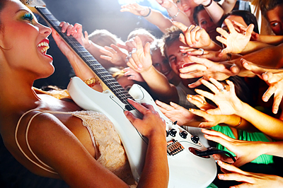
Technically speaking, the schoolbook composition rules will tell you to keep composition conservative, not to cut the forehead in portraits, only take standard pictures with all parts of the image elements inside the frame and such – what a bore! Don’t listen to such nonsense!Every single one of my most successful pictures are composed directly opposite of textbook composition rules and are often cropped. Experiment! Shoot from above, from below and stick to a natural gut feeling when composing your frames instead of rules.
Over the years your sense of composition grows and you will gradually master it in your own way by adding a personal signature to all your pictures.

This photo has lens flare and a composition that would make a newly trained image inspector/reviewer scream. It also has blown-highlights, tilted horizon and only focus on one pair of eyes. The head of the young man is cropped. In many ways this pictures is “text-book crap” but it is nevertheless a lot more interesting than all the basic stuff.
6. Instruct and say “stop”
Instruction is everything! If the model doesn’t know what you want from your shoot/scene then he/she simply will not provide it. Most good models know their best angle and poses and will start posing as soon as they see a camera. Stop this posing roller coaster and engage the model in the situation and make them look human!When shooting more than one person, you should try to engage the people in conversation and real interaction and tell them “STOP” when you want the picture taken. This method is great for getting non-artificial looking pictures that feel like you were never there.
When doing business shoots or staff portraits I often engage my models in games such as writing a story together; the first person writes one or two lines, the next a few lines more, and suddenly they are having fun and are relaxing and great picture opportunities arrive.
7. Be overly productive
My senior assistant, who is a photojournalist, came up to me the other day after doing a backstage report for a Danish rock band and said: “I don’t get it at all…all these other photographers were just sitting around with their cameras and talking…and I know this for a fact because I saw them doing it through my viewfinder”.My assistant saw this whole concert through his camera and took over 1300 RAW files in three hours with his 1Ds. I don’t care how much talent one has; it takes pictures – and a lot of them – to get great shots.
Shoot like crazy, especially if you have a limited time with the models or at the location.
On a good day of shooting stock photography I am sometimes able to get a conversion rate of about 3-4% of my RAWs that convert to end product pictures.
Using percentages to calculate how many RAWs convert into end product pictures is very smart because it leads you to accept one very convincing conclusion; that more RAWs converts into more end product pictures.
This deduction is naively simple and could be objected to in many ways, but it does have some degree of inevitable truth; Sitting around and talking, or being unproductive at a shoot, you can be sure to miss that window of opportunity holding the hit picture – go get shooting and produce like crazy!
8. Don’t ever settle for less

 Here you see a crop of one of my standard studio shoots. You don’t need to oversharpen your pictures, creating artifacts to make them look sharp (providing you use high-quality lenses). This crop is unsharpened, camera setting: zero and developer setting: Zero. There is plenty of resolution and capability in a normal 1Ds Mark II, no need for medium format.
Most photographers who were educated to shoot analogue have shifted to digital, but have done this shift of workflow with no or hardly any digital education or knowledge.
Now this troubles me a bit because a lot of these photographers have very high thoughts about themselves, but really know absolutely nothing about digital workflow and are too proud and “artistic” to care about phenomena like artifacts, banding, tiff files – you name it.
Make it a personal choice not to associate or be part of a photographic environment made up of people like that. Get your digital training from online sources that are up to date.
Within a few years from now, digital standards will rise a lot and then you will be prepared. Go the extra mile and educate yourself using resources such as Lynda.com – and my homepage:www.arcurs.com:)
All content is copyrighted Yuri Arcurs, do not reprint or use without credits and link to www.arcurs.com
From reading this article, I will try to include these ideas whilst taking my photos.
Monday, 27 February 2012
Magazine Name
So, I had decided that my magazine would be called 'Underground'. There are many reasons for this, the main one being that it was the most voted name in my survey.
The rationale behind this name however is that my magazine genre is underground music, so therefore anyone who see's this magazine on the shelf will understand what genre it is from. Another reason for the name Underground is that many of the artists that would feature n my magazine are living, working or studying in London, and London is the only place to have the famous Underground Trains, so its also a clever play on the original Underground in London.
On my masthead, I would like to make the font quite blurry as if its moving so that it creates the effect of an underground train moving, and could also connote that Underground music is growing in this movement. I would also like to fill in the letters 'G, O, and D' in the title, with the colours that you would generally find in the London Underground stations. These colours may also become part of my colour scheme, on top of a dark background.
Here are a few examples of the types of fonts I would like to use on my masthead;

Hopefully I will be able to manipulate these fonts using Adobe Photoshop to suit my magazine.
Sunday, 19 February 2012
Used-To-Be-Underground Artist; Ed Sheeran
This is an SBTV video, from two years ago, of the newly popular artist Ed Sheeran. He appeared on SBTV on 28th Feb 2010, and since then has become very popular.
Main Image Feature
On my front cover, I plan to put the main image of the artist in the middle of the page.
Examples of this are;


Each of these front covers also have the artists image in front of the masthead, which is an idea that I would also like to feature on my magazine.
The image of the artist is a close up, and this is also the type of shot that I would like to use on my magazine cover.

Examples of this are;


Each of these front covers also have the artists image in front of the masthead, which is an idea that I would also like to feature on my magazine.
The image of the artist is a close up, and this is also the type of shot that I would like to use on my magazine cover.

Draft Drawings, Flat Plans and Shot Lists


Flat Plan


In the middle, there will also be the editors letter.

Shot List
The types of shots that will be featured in the magazine are close ups, long shots and mid shots. On the contents page there will also be some extreme close ups and establishing shots. Below is a samll shot list, of the types of shots that I will be taking.

I plan to let the artist wear his own clothes but specifically jeans, a hoody and some trainers, so that his target market can relate to him. I want his hoodie to be brightly coloured as his target audience normally wear bright colours too - These colours will also form the colour scheme for my magazine. I got this idea from some music videos that my target market would have probably watched - This is an example of one music video that my target market would be familiar with. In this video the artists Chris Brown and Big Sean are either wearing hightops (trainers), and jeans. Their tops vary from jean jackets to hoodies and jumpers. This is the type of clothing that my target market would also wear, so it is important that the person on my front cover wears the same types of clothes, as it would attract the right audience to the magazine.
I also plan to take the pictures around Vinceness Estate, the estate where me and my main main artist live, so that people will know what he came from and how much his life has and will change when he becomes more and more famous. My artist is a rapper, and most rappers rap about where they used to live (which is mainly estates), and how their lives have changed since they got famous and started earning money.
I plan to take pictures near and above brick walls, near gates and some in the middle of the road. I got this idea from other famous Underground artists and their pictures; these artists include Rita Ora and Tinie Tempah.

Even mainstream artists such as Chris Brown and Busta Rhymes take photoshoots near brick walls, which is why I think its important to implement a brick wall somewhere in my magazine.
Subscribe to:
Posts (Atom)