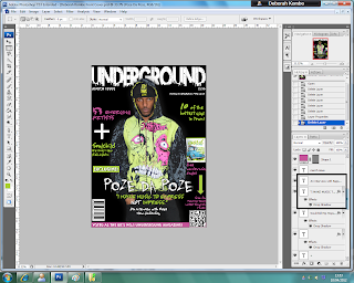
Step 1.
The first step was to open up a new page on Adobe Photoshop, with the right characteristics to create a front cover.
The preset was 'International Paper'.
The width was '210 mm'.
The height was '297 mm'.
The resolution was '150 pixels/inches'.
The colour mode was 'RGB Colour, 16 bit'.
And the background contents was 'White'.
I then tried to find a picture out of all of the pictures to put as my main image. Beforehand, I did a photoshoot with the main artist on the front cover, Poze Da Poze. He will also be featured on my contents page and will be the subject of my double page spread.
The two pictures above are examples of the types of pictures that I had taken and considered using.
Step 2.
In this step I put the main image on the front cover. To do this I took one of the pictures that I can taken from the photo shoot and cut it out of the original picture using Adobe Photoshop. I then copied to cut out picture to make another layer on top of the original picture. After this I dragged the cut out picture onto the front cover, and resized it to fit the page. This is the main picture for my final front cover.
Step 3.
In this next step I decided to add the masthead onto the page. I got the font from a website, www.fontspace.com, and chose one of the graffiti fonts. I chose this particular font because in the font you can see the outlines of a city. Underground music featured in my magazine would mainly be artists from the city of London, which relates to the image seen within the font. Also the word Underground is a word used to name the train system running in the underground in the city of London, which is also another reason for my choice of font.
Step 4.
Next, I decided to add a barcode to my front cover to, as every magazine needs one. I took this one from the internet (google). I put the barcode sideways because many of the music magazines that I had researched had it the same way, so it seemed like a normal convention.
Step 5.
I also added another type of barcode, which would enable smartphone users to scan the code so that they could get a type of app or a freebie on their phone. This is a new type of technological convergence as companies now have this type of barcode to promote their business and to make it available to a wider audience.
In this step I decided to add all of the cover lines and shapes, as well as another small picture on the side.
I also added the price of the magazine, the magazines official website, the issue month of the magazine, and a line at the bottom that describes my magazine as 'Voted as the UK's NO.1 Underground Magazine'.
Step 7.
In this step I added the name of the artist who is featured on the cover of my magazine, Poze Da Poze.
I chose a completely different font for his name to emphasise the importance of his role in this months magazine issue.
I also got this font from www.fontspace.com, the same place as where I got the font for my masthead.

Step 8.
I then added Poze Da Poze's pull quote, and a caption about him under his name to show that the main article in the magazine will be about him.
Final Front Cover;
This is how my front cover turned out.
:)


No comments:
Post a Comment