Step 1.
To create my Double Page Spread I had to use different characteristics to create the page.
I then took one of the pictures that I had taken, and cut out a part of it which was a brick wall. I then pasted this three times on the double page spread, to create the wall effect at the top of the page. My flat plan shows the top part of the page sectioned off so that I could put pictures of the artist along the top. However later on when I tried to put small pictures on top of the wall, it didn't look good to me so I changed it.
Step 2.
I then added a picture of the main artist, Poze Da Poze, which I cut out of one of my other pictures and pasted onto this page. I put the picture over the top of the brick wall, so that the audience would be more attracted to the image rather than the brick wall.
Step 3.
In this step I decided to add the name of the artist, Poze Da Poze, as the title of the article. I chose the same font that I used on the front cover from www.fontspace.com, but changed the colour from white to green. This was done to keep the magazine consistent.
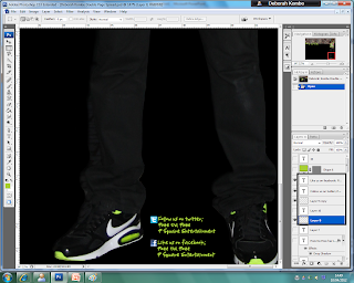
 Step 4. I then added ways to get in contact with the artist; through his Facebook and his Twitter account. This isn't a convention that I have actually seen in a magazine. However I noticed that when you go on an artists official website, they reference the other ways in which their fans can keep up with what they are doing through social networking sites such as Facebook and Twitter.
Step 5.
In this step I added a brief introductory paragraph, about the artist and what we will be covering during the interview.
I typed up the paragraph in Microsoft Word to make sure that the spelling and grammar were correct, and then I pasted it into Adobe Photoshop.
In put the paragraph about the name, Poze Da Poze as at the end of the Paragraph it says 'Underground Alert presents;'. This is a regular feature segment in my magazine, that covers all the interviews about new upcoming Underground artists from the scene. 'Underground Alert' is a feature in the magazine to alert the readers.
Step 6.
I then decided to add all the shapes which I wanted on the page, which was a banner on the top left hand corner, which I will then write the word 'EXCLUSIVE' in (this matches the one that is on the front cover to keep the magazine consistent), and a box at the bottom of the page which is where I planned to write the page number.
Step 7.
In this final step I added all of the text from the interview. I typed up the interview in Microsoft Word and then copied and pasted it into Adobe Photoshop.
I put the questions in pink, and the answers in white, to help make it clear to the reader who is who in the interview.
I also added the pull quote which was on the front cover of the magazine in a box that had been edited, however the layers had been pressed so there is not separate layer to show how that box on the middle had been made. The interview is Poze Da Poze's first interview ever.
Final Double Page Spread;
This is how my Double Page Spread turned out.
-
Poze Da Poze is a real up and coming artist. If you would like to see more about him you can go to his Facebook page and follow him on Twitter.
Twitter: http://twitter.com/#!/pozedapoze
Facebook: http://www.facebook.com/pozedapoze
:)


.png)


No comments:
Post a Comment